Five Tips for Achieving Balanced Color in Interiors
This post may contain affiliate links which means I may receive a commission for purchases made through links. As an Amazon Associate, I earn from qualifying purchases. Learn more on my Private Policy page.
Achieving a perfectly balanced color scheme in your interiors can seem like a daunting task, but fear not, there are practical tips to help you navigate this colorful journey.
From understanding the basics of Color Theory to strategically incorporating accent hues, each step plays a crucial role in creating a harmonious space.
So, whether you're aiming for a serene monochromatic look or a vibrant mix of shades, these five expert tips will guide you towards achieving a well-balanced and visually appealing interior.
Understanding Color Theory
To grasp the essence of color theory effectively, start by understanding the basic principles that govern how colors interact and influence each other. Color psychology plays a significant role in how different colors can affect mood and perception within a space. For example, warm tones like reds and oranges can evoke feelings of energy and warmth, while cool tones such as blues and greens tend to create a sense of calm and relaxation. By considering these psychological effects, you can strategically choose colors that align with the desired ambiance of your space.
Furthermore, exploring various color combinations is essential in creating a harmonious and visually appealing environment. Complementary colors, which are opposite each other on the color wheel (e.g., blue and orange), can create a vibrant and dynamic look. Analogous colors, which are adjacent to each other on the color wheel (e.g., blue and green), offer a more subtle and cohesive palette. Understanding how these color combinations work together can help you achieve balance and unity in your interior design.
Choosing a Color Palette
Understanding color theory sets a solid foundation for selecting a harmonious color palette that will enhance the ambiance of your space. When choosing a color palette for your interiors, consider color psychology to evoke the desired emotions in each room. Different colors can influence mood; for example, blues and greens are known for their calming effects, while yellows and oranges can bring warmth and energy. By understanding these principles, you can create a space that not only looks visually appealing but also feels right for its intended use.
Harmonious combinations are key to a cohesive color palette. Look at color trends for inspiration, but remember that personal preferences should ultimately guide your choices. Consider the existing furniture and decor in your space, ensuring your color palette complements rather than clashes with these elements. You can also use tools like color wheels to find complementary, analogous, or triadic color schemes that work well together.
When selecting colors, think about the overall feeling you want to create in each room. Soft pastels can make a room feel light and airy, while deep jewel tones can add richness and sophistication. By balancing color psychology, harmonious combinations, color trends, and personal preferences, you can create a color palette that transforms your space into a harmonious oasis.
Incorporating Neutrals Wisely
When incorporating neutrals wisely in your interior design, remember that they serve as a versatile foundation for adding pops of color and creating a balanced visual appeal. Achieving neutral balance is key to setting the stage for your color accents to shine. Neutrals such as white, beige, gray, or taupe can create a calming backdrop that allows other elements in the room to stand out.
To maintain neutral balance, consider using varying shades and textures of neutrals throughout the space. This can prevent the room from feeling too monotonous or dull. For example, you could layer different shades of gray through furniture, rugs, and curtains to add depth and interest while still keeping the overall look cohesive.
Another way to incorporate neutrals wisely is by using them in larger furniture pieces or walls, allowing for more flexibility when adding colorful accents. This approach ensures that the neutrals provide a grounding effect, while the pops of color bring energy and personality to the space. You can introduce color accents through throw pillows, artwork, or decorative accessories to create visual interest without overwhelming the room.
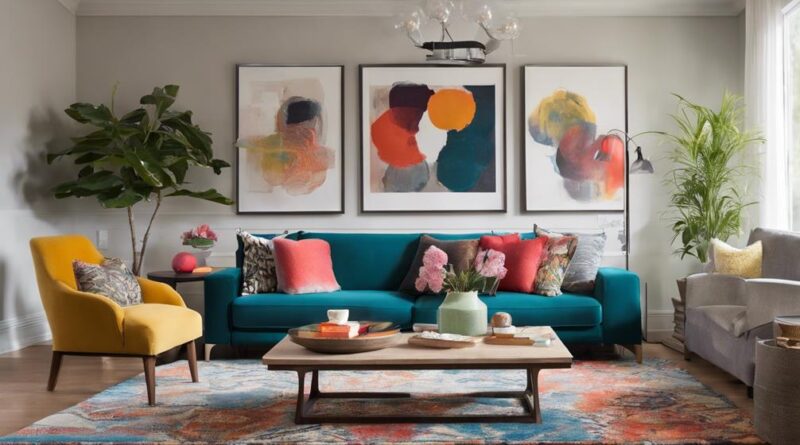
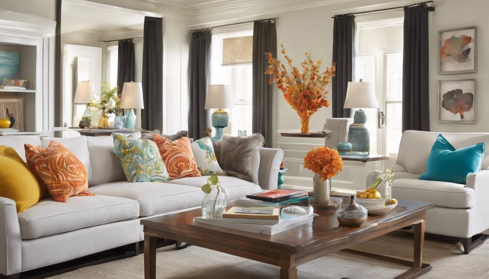
Adding Pops of Color
For a vibrant and dynamic interior, infuse your space with strategic pops of color that complement your neutrals and elevate the overall aesthetic. When adding pops of color to your living space, consider the principles of color psychology to create a design impact that resonates with you. Bold accents can inject energy and personality into a room, while maintaining a subtle balance with your existing color scheme.
Select colors that evoke the desired mood or atmosphere. For example, shades of blue and green promote calmness and relaxation, perfect for bedrooms or reading nooks. On the other hand, reds and yellows can add warmth and vibrancy to social spaces like the living room or dining area. By understanding the psychological effects of different colors, you can tailor your color choices to suit the function of each room.
To ensure a cohesive look, introduce pops of color through accessories like throw pillows, rugs, artwork, or accent furniture. These elements can be easily swapped out or updated to refresh your space without a major overhaul. Remember, the key to successful color integration lies in striking a harmonious balance between your neutrals and bolder hues. Experiment with different combinations until you find the perfect mix that reflects your personal style and enhances the overall ambiance of your home.
Balancing Light and Dark Shades
Achieving a harmonious blend of light and dark shades is essential for creating depth and contrast in your interior design. When balancing light and dark colors in a room, consider the lighting effects to ensure the colors interact harmoniously. Dark shades absorb light, making a space feel cozy and intimate, while light shades reflect light, creating an airy and open atmosphere. By strategically placing light and dark elements, you can play with color contrast to add visual interest to your space.
To make the most of your light and dark shades, pay attention to how natural and artificial lighting affects them. Natural light can enhance the richness of dark hues and bring out the subtleties in lighter tones. On the other hand, artificial lighting can sometimes wash out colors, so it's important to test how different light sources interact with your chosen palette.
Color contrast is key when balancing light and dark shades. Pairing a light wall with dark furniture or vice versa can create a striking visual impact. Incorporating accents like throw pillows, rugs, or artwork in contrasting colors can further enhance the dynamic interplay between light and dark elements in your design. Remember, achieving balance isn't about equal proportions of light and dark, but rather about creating a cohesive and visually appealing composition that suits your style.
Playing With Textures and Patterns
Looking to add depth and visual interest to your interior design? One effective way to achieve this is by playing with textures and patterns. By mixing textures creatively and layering patterns tastefully, you can create a space that feels dynamic and visually captivating.
Tips for Playing With Textures and Patterns:
- Mixing Textures Creatively: Experiment with a variety of textures such as smooth, rough, soft, and shiny to add dimension to your space. Combine materials like wood, metal, glass, and fabrics to create a rich sensory experience. For example, pair a sleek leather sofa with a chunky knit throw for a striking contrast.
- Layering Patterns Tastefully: When incorporating patterns, consider the scale and color palette to ensure a harmonious look. Mix different patterns like stripes, florals, and geometric prints but keep them within a cohesive color scheme. For instance, you could layer a bold striped rug with floral throw pillows in complementary hues.
- Adding Visual Interest: Use textures and patterns strategically to draw attention to key areas in the room. A textured accent wall or a patterned statement piece of furniture can serve as a focal point, adding personality and style to your design. Remember, balance is key when playing with textures and patterns to create a visually appealing space.
Using Accent Colors Strategically
When strategically using accent colors in your interior design, aim to create focal points that enhance the overall aesthetic appeal of the space. Color psychology plays a crucial role in this process as different colors can evoke various emotions and set the desired mood. For example, warm tones like reds and oranges can create a cozy and inviting atmosphere, while cool tones like blues and greens can impart a sense of calmness and tranquility.
Accent placement is key when incorporating these colors into your design. Consider using accent colors on a feature wall to draw attention to a specific area or on statement furniture pieces to make them stand out. By strategically placing accent colors, you can guide the eye around the room and highlight the architectural elements or decor you want to showcase.
When choosing accent colors, think about the existing color scheme of the room. Select hues that complement the dominant colors to create a harmonious look. Introducing too many accent colors can lead to a chaotic and overwhelming space, so it's essential to strike a balance. Remember, accent colors should enhance the overall design without overpowering it. By following these tips on color psychology and accent placement, you can achieve a well-balanced and visually appealing interior design.
Seeking Harmony in Color Schemes
To maintain a cohesive and visually pleasing interior design, ensuring harmony in your color schemes is essential. Achieving color harmony not only enhances the aesthetic appeal of a space but also plays a crucial role in influencing the mood and atmosphere within the room.
Here are three key points to help you seek harmony in your color schemes:
- Understanding Color Psychology: Colors have the power to evoke emotions and affect the overall ambiance of a room. By delving into color psychology, you can select hues that resonate with the desired mood you wish to create. For instance, calming blues and greens are ideal for promoting relaxation in bedrooms or living areas, while vibrant yellows and oranges can inject energy into spaces like home offices or kitchens.
- Creating Visual Balance: When choosing a color scheme, it's essential to consider visual balance. This involves distributing colors evenly throughout the space to ensure a harmonious flow. You can achieve balance by incorporating a mix of dominant colors, secondary colors, and accent colors in appropriate proportions. This balance prevents any single color from overpowering the room while maintaining a cohesive look.
- Enhancing Mood Through Color Harmony: Color harmony is key to setting the tone and mood of a room. By selecting colors that complement each other on the color wheel, you can create a sense of unity and cohesion in your design. For example, analogous color schemes, which consist of colors next to each other on the color wheel, often create a soothing and harmonious atmosphere, perfect for areas like bedrooms or reading nooks.
Frequently Asked Questions
Can the Same Color Palette Work for All Rooms in a House, or Should Different Rooms Have Different Color Schemes?
When choosing a color palette for your house, consider both color psychology and consistency. While the same palette can create a cohesive look, room function should also guide your choices.
Different rooms may benefit from distinct color schemes to suit their purposes, but aim for overall harmony. Striking a balance between uniformity and individuality will help maintain a cohesive feel throughout your home while catering to each space's specific needs.
How Can I Incorporate Bold, Vibrant Colors Into My Interior Design Without Overwhelming the Space?
To bring bold, vibrant colors into your interior design without overwhelming the space, try mixing patterns for a dynamic look. Choose statement furniture pieces in those bold hues as focal points. This way, you can infuse energy and personality without going overboard.
Remember to balance the vibrant colors with neutral tones to create a cohesive and visually appealing space. Experiment with different textures and finishes to add depth to your design.
Are There Specific Color Combinations That Work Best for Small Rooms to Make Them Appear Larger?
In small rooms, utilizing neutral shades can create lighting illusions that make the space appear larger. Pairing light colors with strategic pops of brighter hues can enhance optical illusions for a more spacious feel.
What Are Some Tips for Incorporating Color Into a Rental Space Where Painting Walls May Not Be Allowed?
To add color to a rental without painting, consider temporary wallpaper. It's easy to apply and remove when you move out. Opt for colorful furniture pieces that can brighten up space without the need for a paint job. These additions can transform your rental into a vibrant and personalized home, even with restrictions on wall colors.
Temporary wallpaper and colorful furniture are excellent ways to inject personality into your space.
How Can I Ensure That My Color Choices Will Stand the Test of Time and Not Go Out of Style Quickly?
To make sure your color choices stay stylish, opt for timeless hues that have color longevity. Consider classic shades like navy, gray, or olive that won't quickly go out of style.
Conclusion
Now that you have learned these five tips for achieving balanced color in interiors, you can confidently transform any space into a harmonious and visually appealing environment.
By understanding color theory, choosing the right palette, incorporating neutrals, adding pops of color, and balancing light and dark shades, you can create a space that feels cohesive and inviting.
Remember to play with textures and patterns, use accent colors strategically, and seek harmony in your color schemes for a truly balanced look.